Newspaper Imagery
The historical newspaper screenshots throughout this piece come from two open archives.
Library of Congress - Chronicling America
The New York Times TimesMachine Archive
- "Wounded Hero Birds." Photo, U.S. Army Signal Corps. May 25, 1919, page 80. TimesMachine link
- "Carrier Pigeons Real Heroes of Air." February 11, 1923, page 154. TimesMachine link
- John C. Devlin, "Pigeons Blamed in 2 City Deaths." October 1, 1963, page 41. TimesMachine link
- "Hoving Calls a Meeting to Plan For Restoration of Bryant Park." June 22, 1966, pages 49 and 59. TimesMachine link
Cher Ami Imagery
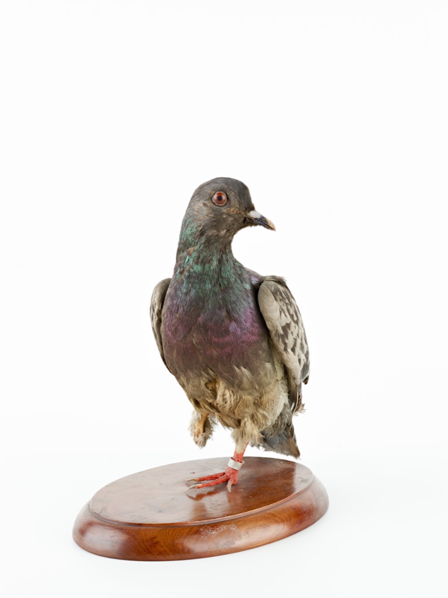
The placeholder photograph of Cher Ami's taxidermied body comes from the Smithsonian National Museum of American History's online collection: si.edu/object/cher-ami.
I captured the 3D Gaussian Splat of Cher Ami by recording a walk-around video on my iPhone of the taxidermy on display at the Smithsonian National Museum of American History. I processed the video into a .ply Gaussian splat using Kiri Engine, converted it to .ksplat for faster web delivery, then rendered it in the browser with Three.js and @mkkellogg/gaussian-splats-3d.
Data Sources
Linguistic Corpora
Pigeon Observations
- eBird, Cornell Lab of Ornithology, for recent rock pigeon (Columba livia) observations near each city centroid: ebird.org/data
- GBIF, the Global Biodiversity Information Facility, for historical Columba livia occurrence records: gbif.org
Building Footprints and Census Tracts
- Open Data DC for District of Columbia building footprints and census tract boundaries: opendata.dc.gov
- NYC Open Data for Building Footprints (
5zhs-2jue) and 2020 Census Tracts (63ge-mke6): opendata.cityofnewyork.us
Technologies
Quarto
site framework and static build system
HTML / CSS / JavaScript
page structure, styling, and custom interactions
Three.js
WebGL renderer for the Cher Ami 3D scene
@mkkellogg/gaussian-splats-3d
loading and rendering the Cher Ami .ksplat Gaussian splat
GSAP + ScrollTrigger
pinned scrollytelling sections and scroll-driven progress
Observable Plot
newspaper framing charts and the comparative scatterplot
D3
CSV loading and chart/data transforms
Leaflet
interactive DC and NYC choropleth maps
proj4
projected coordinate handling for tract geometry
Kiri Engine
iPhone-video-to-Gaussian-splat processing
AI Usage
AI tools were used as aids for scaffolding, visualization design, coding support, debugging, and asset generation. The final analytical decisions, interpretation, and editorial choices are my own.
OpenAI Images was used to generate reference icon imagery, which I then traced and refined into final SVG assets in Adobe Illustrator. The finished icons on this site are my own SVG work; the AI-generated images served as visual references during the design process.
Anthropic's Claude and OpenAI's Codex helped scaffold the site's technical structure, wire Quarto to the JavaScript libraries, troubleshoot data and rendering issues, and explain unfamiliar techniques such as browser-based Gaussian Splat rendering and scroll-driven animation with GSAP ScrollTrigger.
I also used AI tools as a sounding board during data analysis to debug API endpoints, troubleshoot data-pull failures, and discuss methodological trade-offs. The final interpretation of the data is my own.
Methodology
The linguistic story is built on weighted collocation analysis. For each newspaper item containing the word "pigeon," I counted how often words from five hand-curated category lists - heroic / utility, sport / hobby, culinary, hunting, and nuisance / disease - appeared within a 15-token window of "pigeon." Each match was weighted by its distance from the target word, so adjacent words counted close to 1.0 and words 15 tokens away counted about 0.06. The category lists were built from frequent collocates of "pigeon" in the collected corpus and then manually grouped into themes; OCR artifacts and neutral filler words were excluded.
Per-article scores were normalized by article count when comparing across years, producing the "frame hits per article" metric used in the charts. The final public-facing time-series charts use the NYT rows from annual_collocation_tone_by_source.csv for the 1880-2000 arc, plus nyt_decade_collocations.csv for the vocabulary callouts. Chronicling America informed the broader archive, source selection, and historical context, but its per-article rates are not mixed with NYT rates on the same chart.
This separation matters because the corpora expose different kinds of text. Chronicling America records are longer and noisier OCR/page records, while the NYT API returns shorter metadata fields such as headline, abstract, snippet, and lead paragraph. The same collocation method can be run on both, but the final visual comparisons avoid treating the two text lengths as directly interchangeable.
The geospatial analysis aggregates eBird and GBIF Columba livia observations to the census-tract level for DC and NYC, computing pigeons per square kilometer and buildings per square kilometer for each tract. DC tract geometry is handled in EPSG:26985; NYC tract geometry is handled in EPSG:2263 and converted to square kilometers. NYC's building-density measure counts buildings 100 feet or taller from the NYC Open Data building-footprints pull; DC's measure counts all building footprints, matching the city's lower-rise built environment.
A note on the eBird and GBIF data: citizen-science observations reflect where observers go, not strictly where pigeons are. The signal is useful for comparing observed urban pigeon density, but it is biased toward parks, tourist areas, and well-traveled observation routes.